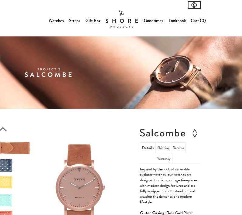
This is a watch company based out of the UK. I love their watches, but their website’s UX/UI experience got me hooked (along with some beautiful packaging)
The design here is simple, just as it is across all their pages, creating a nice visual flow and pattern. Allowing ample positive and negative space within the page makes choosing your selections simple and intuitive. Typography is minimal, but varies enough to show clear hierarchy of information. The use of bleed in the images draws you into the layout.
Great product, design, and presentation. A double thumbs up to Shore Projects.

